 The link has been present for some time in the menu on the left, but the project is finally mature enough to be presented. In 1925, Fernando Pessoa, the famous Portuguese poet, wrote a touist guide about the city he almost never left: Lisbon. A text with no poetic intention, written directly in English (the complete title is Lisbon, what the tourist should see), to tell the world about the marvels of his beloved city. They were quite preserved in the XXth century, and modulo renaming, most of the monuments cited and their descriptions have not changed since. The guide was therefore translated to many languages after being discovered in the end of the 90s in the author's manuscript "trunk".
 The text was first published in a bilingual English-Portuguese version by Livros Horizonte. Unfortunately, this edition contains the original text without editor 's notes or index, and with only a map of the city in 1929, rather difficult to read. Therefore, it can hardly be used to find information while visiting Lisbon. However the text was reedited this year in English by a British publisher, Shearsman, with some more content. They updated the names of the places and persons into their modern style, and added some photos of the city from postcards from the 20s.
To make this guide even more useful for the tourist, I've created an interactive version of Lisbon, what the tourist should see, with a Google map, and some photos taken during a lovely week spent in the city, as well as some found on the Wikipedia or Flickr.
I scanned the Livros Horizonte version of the book which I had just brought back from Lisbon, performed optical character recognition with SimpleOcr (not very reliable, but free...), to get the complete text which is now freely available (Pessoa has been dead for more than 70 years) at:
 Places and streets cited in the guide were then localized on a map of Lisbon, to get a geographic visualization of the book, where Pessoa gives in fact three circuits - the first one, in blue, is quite long, the other two, green and red, are given for the tourist who"can stay one day more". The book ends with a description of Portuguese journals at that time, then details of some villages in the area. The main (blue) itinerary, which starts from the sea, requires a car. In fact, as it is impossible to make all visits in one day, it can be split into many parts that can be visited on foot or with public transportation. But be careful, in this case, follow the map instead of the ordering of the visits in the book, as the path described there is absolutely not a solution of the TSP! This choice is not random either, as Pessoa distributed the most important visits (the Baixa district, the Alfama, the Castle of Saint George, the Hieronymites Monastery, the Tower of Belém, etc) uniformly along his text.
 A Google map is quite nice, but not so useful if you travel without internet! By the way if you're looking for an internet connection in Lisbon try Rua da Madalena. The map is also available in a printer-friendly version, with a number associated to each place (don't worry if the page takes some time to load, usually more thant 10 seconds for me ;)). To get the labels of those numbers, sorted as they appear in the text, go to the bottom of this printer-friendly version of the text.
If you have access to the interactive version though, you get much more information. For many places, there is a link to its Wikipedia page, or even its official website (with opening hours, for museums).
This supplementary information, which transforms this text into an interactive book, has not been added directly to the original text. In fact I created a PHP+MySQL+Javascript system to automatically insert in the text this information which is stored in databases. The picture below tries to explain the principle. Besides the text, there are 3 databases: the blue one which stores locations in the text of occurrences of the places, the orange one stores the places, and the purple one stores coordinates. Now let's explain the arrows below. For a given set of coordinates on the map, stored in the purple database, there may be one or many interesting things to see (for example on Praça do Comércio there is also an equestrian statue of King José I). Each of these things to see has a file in the orange database, which gives its name and description, sometimes a photo as well. Note that if you want the website to give you information on places in another language, you just have to translate this database and not the whole site! Finally, to know where all these interesting things appear in the text by Pessoa, the position of the characters where they appear is stored in the blue database. It is then possible that one of them appears at different places in the text, like Praça do Comércio below. If the original text is modified (translated, for example), then this blue database has to be changed too.
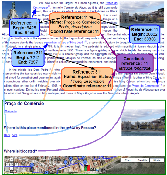
To finish the project I still have to complete the orange database (I've currently done more than one third). However you can already access everything added so far, especially the text illustrated with photos here. And of course the Google map, which is the basic element of this mashup (contact-me to get the sources if you have a similar project of interactive book) on a theme by Pessoa.
So you can start planning your one week (or more) trip to Lisbon in good company: the one - at least - of some elements, printed or downloaded, from the site...
This post was originally published in French: Livre interactif : Lisbonne par Pessoa.

 Even if I'm not an expert in
  Recipes are so accurate: you get a list of ingredients with exact quantities, and how to use them, but no warranty on what happens if you don't exactly respect the quantities. That's why I will define a tool to represent
  From the lower left to the upper right, the number of eggs in the recipes decreases (as there is more and more flour and milk). On the upper left corner we have lots of flour, and on the lower right corner, more milk. And what is this kind of
 Well, just wait before pouring your "pâte à crêpes" onto waffle iron: you may want to add some
 Here again what wa see is a convex hull, in 3 dimensions, on dots (x,y,z) where x is the number of eggs, y the quantity of milk and z the quantity of flour. I put the dots by choosing a minimum limit and a maximum one on the number of eggs to get this


