Showing posts with label spreadsheet. Show all posts

Saturday, April 19, 2008

Cooking for nerds: ingredient polyhedron and convex hull

Even if I'm not an expert in molecular gastronomy, I'm often very impressed by transformations of form, color or texture that happen when I cook. It's so nice the mutations of those choux au Comté in the oven, or how beaten egg whites can turn into crisp meringues on my radiator. Don't worry, I won't talk about chemistry and how those reactions work, but just to what extent it can work.

Recipes are so accurate: you get a list of ingredients with exact quantities, and how to use them, but no warranty on what happens if you don't exactly respect the quantities. That's why I will define a tool to represent ingredient quantity robustness in a recipe in this post: the ingredient polyhedron. And a method to compute it from many receipes of the meal you want to cook, found on the web for example. My example will be crêpes, our French flat pancakes.

This dessert is done with roughly 3 ingredients (and of course butter for the pan, but we will just speak about ingredients of the batter), we will thus get a very nice 3D picture. So: eggs, flour, milk, those ones appear in all of the 19 recipes I've gathered in this OpenOffice spreadsheet file thanks to the following websites: lejus.com, 1001delices.net, recette-crepe.net, goosto.fr, supertoinette.com, recettes.qc.ca and the French reference Marmiton (sorry for my vegan friends). But maybe I'll just start with 2 ingredients to show how the whole thing works. Say we have already decided the number of eggs to use, one for example. We then compute according to all recipes, with a rule of three, the quantity x of milk and y of flour that have to be added (I translated everything to grams for simplicity). Those coordinates can then be plotted on a graph, to get the following dots:

From the lower left to the upper right, the number of eggs in the recipes decreases (as there is more and more flour and milk). On the upper left corner we have lots of flour, and on the lower right corner, more milk. And what is this kind of elastic band which sticks around the dots? It's some kind of safety area: any point within this area should correspond to ingredient quantities that works for the recipe. Well, at least that's what I hope: any point of the segment between any two points that work should work too, send me your counterexamples if you do not agree. Anyway, this area is called the convex hull of the point set, and there are many algorithms to compute it automatically. So of course to avoid taking risks you may want to target the middle of the convex hull. Notice that 3 recipes with the same main ingredient quantities correspond to a quite central dot (half a liter of milk and 250 grams of flour for 3 eggs).

The convex hull also shows the robustness of the recipe according to each parameter, that is how accurate you have to be when measuring each ingredient. Note how narrow the convex hull is (it would be even more if I had chosen the same vertical and horizontal scale). This means that depending on the recipe, the quantity of eggs may vary a lot, but not the proportion milk/flour. We can plot for each recipe the difference between the ratio of two ingredients, and the average ratio for those two ingredients:

If you do the average of the absolute value of those deviations, you get: 16% for the milk/flour ratio, 28% for flour/eggs, 31% for milk/eggs. The milk/flour ratio varies much less than the other ratios among the recipes, so you have to be more careful in this proportion than when choosing the number of eggs. So we have just illustrated and proven this nice theorem: the recipe of crepes is pretty robust to the variation of the number of eggs.

You can also have fun by showing many desserts which share the same main ingredients on the same graph:
Well, just wait before pouring your "pâte à crêpes" onto waffle iron: you may want to add some baking powder and vegetable oil...

To conclude, let's take a look at the 3D ingredient polyhedron thanks to this very nice applet by Tim Lambert (he even shares the source that I was able to modify to include my crepes points), you can use the mouse to control and move it:


Sorry, but you need Java to see the animation.

Here again what wa see is a convex hull, in 3 dimensions, on dots (x,y,z) where x is the number of eggs, y the quantity of milk and z the quantity of flour. I put the dots by choosing a minimum limit and a maximum one on the number of eggs to get this frustum, such that any cut perpendicular to the x axis (for a constant number of eggs) gives exactly the same convex hull polygon as above. To really use it we should let the user enter the quantity of ingredients he just used: if the dot gets inside the polyhedron, no problem, otherwise... you may try the restaurant tonight!

Monday, March 24, 2008

Reverse engineering Google Trends (2): margin of error

As I wrote in my last post, today I'll be quite technical with the margin of error of my computation. And some considerations to try to mimimize this error in the end of my post. Last time on Veronising: I chose a hierarchy of terms which have higher and higher Google Trends curves, to evaluate, by a sequence of rules of three, the frequence of Google searches for the highest term compared to the least looked for.

For the computation I intuitively chose the words such that for each pair of consecutive ones, the first one had a peak approximately twice as high as the second one. The margin of error when reading the value of the curves is approximately 1 pixel, but this absolute error is not the same relative error on the higher, and the lower curve. The higher one always peaks at 113 pixels: 1 pixel of error is less than 1% here. However if the lower one peaks at 50 pixels, it will be a 2% error. If the curve is never over 3 pixels, then the error is more than 30%! So do we have to choose a hierarchy of curves very close to each other? Not necessarily, because in this case we may indeed reduce the error at each step of the computation, but we increase the number of steps (thus, the number of errors) between the least and the most seached.

I couldn't help but mathematically modeling this delicate balance that I've just expressed in a sentence. I call a the ration between the max of the highest and the lower curbe within a pair of consecutive ones (thus a>1). To simplify the problem, I consider that this ratio is constant in my whole scale of words. Then, ideally, I would like to find a word 1 searched x times a day on Google, a word 2 searched ax times, a word 3 searched a2x times... a word n+1 searched anx times.

Now, let's compute the error: instead of reading a height of k pixels for a word, and ak=113 for the next one, say I make an error of 1 pixel, each time too high (this is a pessimistic assumption, actually the error probably alternates, once one reads too high, once too low...). In my computation, without error with the rule of 3 I should find as the number of searches for the highest term:
x.113/k = x.ak/k = xa

The problem is my 1 pixel error, so when I apply the rule of 3 I get in fact:
x.113/(k+1) = x.113/(113/a+1) = x.113a/(113+a)

Thus at each step I multiply by 113a/(113+a) instead of multiplying by a, so for the most searched word, I find x(113a/(113+a))n instead of xan. I underestimate the real value, so to minimize the error I must find the a>1 that maximizes x(113a/(113+a))n.

Second part of the computation: the number of steps, that is n+1 words, of course... but this n depends on a. Indeed we consider that the least searched word (x times) and the most searched one (x'=xan times) are fixed. Then x'=xen ln a, so ln(x'/x)=n ln a and finally n=ln(x'/x)/ln a.

We put this into the upper formula, so we underestimated all the words of the hierarchy, and the highest was evaluated to:
x(113a/(113+a))ln(x'/x)/ln a

which we now have to maximize according to a. A quick analysis of this function at its limits shows that it tends to 0 in 1+, and to 1 in +∞. Very well, it expresses the dilemma I was mentioning in the 2nd paragraph. However it doesn't give us where the max is reached, and neither Ahmed the Pysicist, nor Julian the Mathématician, helped respectively with Mathematica and Maple, could give me a nice formula, there are still some ugly RootOf(...) in the formula.

No problem, we'll just find an approximation using Open Office Spreadsheet. The file is there, and here is the curve obtained for a ration of 20,000 between the most searched and the least searched word (the figure approximately corresponds to what I found for my hierarchy):
So the minimal error is reached for a approximately equal to 2.75 (i.e. a maximal height of 41 pixels for the lower curve). Then it's less than 25%. Of course it seems a lot, but remember the remark on how pessimistic this scenario was, with errors cumulating by successive underestimations. I still have this interesting theoretical question: is it possible to compute the expectancy of the error on the computed value of the most searched word, if at each step the error randomly varies between -1 and +1 pixel? ?

One can also notice the curve increases a bit faster on the left than on the right. As shown in green on the graph, it seems that we'd better choose a hierarchy such that consecutive reference words have a number of searches ratio of 4 rather than a ration of 2.

Now, here are some other hints to improve the accuracy of the computation. First, measure accuracy: instead of just measuring the maximum, where we know there is an inevitable error, we can try to compute it from measures with less errors. I come back to my example from the previous post with cat, dog, and phone:
Comparison cat ~ dog (curve 1) : 65 px ~ 113 px
Comparison dog ~ phone (curve 2) : 69 px ~ 113 px

Except that instead of measuring the maximum of dog, we can evaluate it the following way: do the average of the values of the curve 1 for dog, the average of the values of the curve 2 for dog. Then deduce a very accurate scale change. Finally multiply the maximum of dog on the curve 1 (that is exactly 113 pixels, no error here) by this scale change!

Another problem now: how to obtain the average of the values of a Google Trends curve? With the CaptuCourbe, of course! Be careful here: some values may not be retrieved by the CaptuCourbe (color problem, for example the curve is cut by a vertical black line hanging from a Google News label bubble). So you have to compute the average of the curves on values you really managed to retrieve!

One more thing, the CaptuCourbe is not very accurate because it gets the values of all pixels of some color from a curve, and computes the average, for each column of retrieved values. I've developed a new version, online soon, which allows to get the maximum of the heights of pixels of some color. I'm using this functionality in my method to compute the max, however it's still the average choice I make to get the average of the curves. This is not a small detail, as you can see on the Britney Spears Google Trends curve, that I extracted in both ways:
A 20% error in the measure of many peaks using the pixels of the same color is really something!

So, to close this series of posts on the vertical scale of Google Trends, I still have some questions left. First, get a "value of the foo" in the number of daily searches. Then I could try to program the whole chain of curve retrieval, measures, and computations, as described in my first post, to provide a utility which would add the vertical scale to a Google Trends curve. Anyway don't expect too much, I'd better wait and see whether the API Google is preparing will provide this data.

Estimating the number of searches for some keyword is still a nice challenge., I've discovered GTrends Made Easy, a freeware which gives some estimations computed with a method similar to mine here (in fact he does only 1 rule of three, comparing the request word with a reference word for which he knows the number of Google searches, approx 500 ; that is words which appear between 5 and 50000 times a day, that is less than 100 foo), which was described on this YouTube video.


This post was originally published in French: Rétroingéniérie de Google Trends (2) : marge d'erreur.

Sunday, March 2, 2008

The birth of a buzz, live

I've been dreaming for some time to follow on the web the birth of a buzz, and evaluate the reaction of the tools dedicated to their analysis and detection. I would have prefered better circumstances, but I was able to do it for the tragedy of the Northern Illinois University shooting two weeks ago.

The name of the gunman was not published on the evening of the drama. But 10 hours later, the Chicago Tribune provided
enough elements to guess it on their website
. Of course they wrote quite hypocritically:
The Tribune is not naming the gunman because police have not officially completed the identification of his body.
A simple search for articles co-signed by Jim Thomas with the keywords "self-injury" and "prison" would identify the suspect: Steve Kazmierczak. At 8:10GMT, a visitor of the Wikipedia modifies the article about the shooting to add that name. 30 minutes later, a first blog post cites it, its author updates it many times to add other info found on the net. The name appears then in a live journal and on a forum, and at 10:33 is cited by the Daily Mail (the article has been update since). Then people start to google it a lot, and it reaches the top of the "hot trends" list. It's then cited by some splogs, which apparently make money by citing those trends sometimes with extracts of web pages about it, retrieved automatically. At 14:42, the Associated Press announces that the police gave the name: Steven Kazmierczak. I stopped following the buzz there, as articles or webpages about it then used "Steve", "Steven" or "Stephen".

Anyway, following the first hours gave me the opportunity to see how fast the web reacted. As I mentioned it, the Wikipedia first gave the name. Once more we can wonder about the ethics of the project, and note that it has become THE place to find the latest scoops. See how reactive it is to the death of a celebrity? You can even use the Wikirage tool, which put on top of its hot article list on February 13: Henri Salvador, Imad Mougniyah, et Badri Patarkatsishvili.

About the blogosphere tools, one can notice that BlogPulse isn't very responsive. Of course Google Blogsearch detects quite fast the first blogpost on the topic, in a Blogpost blog... However Blogsearch and Technorati seem to have a similar efficiency: the Technorati curve is a bit higher after 2PM because of some splogs, which Google Blogsearch didn't display (on purpose, i.e. better splog detection?).

The reaction of search engines on the "Steve Kazmierczak" request is also quite interesting. They don't detect the buzz in the first hours, except Google. Even if it's not very clear on the graph, the number of relevant results increases from 61 at 10:30 to 68 at 4PM (and those new pages deal indeed with the gunman). But this contrasts with the big rise of the total number of results, which reinforces the mystery on Google numbers. Did the number of pages for this request really double in 5 hours, or is it just a suspicious approximation?

But the most important may be in the Google Trends curves. Before the press dared to give the gunman's name, before Wikipedia learned of it, before the tabloids found out, Google knew, with the first searches on the name less than 3 hours after the shooting. Their leadership over other search engines also gives them a direct access to information, and their tools are ready to treat this as much as they can. With geolocation in particular, to determine the origin of requests, and maybe identify a local buzz. So when will Google launch a press agency or a tabloid, to uncover scoops and rumors hours before the Daily Mail? And who can access those Google Trends data live today? On the website, the curves are currently updated after 48 hours, not available for words not searched enough, the horizontal scale is not explained (I'm guessing that the 4AM dot represents the number of searches from 3AM to 4AM but I may be wrong), without even mentioning the lack of a vertical scale! A Google Trends API may give the possibility to access this data, and give back to the internauts the knowledge learned from them.


This post was originally published in French: Suivi en direct de la naissance d'un buzz.
The data I gathered and used for the graphs (OpenOffice Spreadsheet file)

Sunday, January 27, 2008

Danger: deadly hobbies!

I'm not familiar with the American blogosphere (I hope blogging in English will help discovering it), but there is a blog there I often visit, xkcd, full of witty or funny comics... for a somewhat restricted audience (I mean as geek as their author, Randall Munroe, who also created some other pretty nice stuff).

I especially enjoyed one of his latest drawings which uses Google result numbers, as I've already done for spelling, congressmen celebrity, or the birthdate of the web :
This picture created a slashdotted Google Bomb as the number of Google answers for "died in a blogging accident" exploded. Of course lots of bloggers felt very concerned and cited the picture while adding results of their own Google searches on the same principle. That website, and the xkcd forum show numerous attempts to find unusual dangerous activities.

But couldn't we just submit Google a list of all English verbs, and let it tell us which one creates most deadly accidents? Of course, here comes the method I used, then the results.

Step 1, retrieving a list of all English verbs. Quite painful, as you can see in these 404-ridden Google Answers, or those 5 pages of outdated or useless answers in a forum... I decided to trust my favorite search engine, and sent it a list of all verbs that went through my mind. Too bad, it replied with complete dictionaries, so I had to forbid some noun, hat, and eventually, on page 3 for -hat strike give abandon wipe rub search seek hang eat adjust draw conclude reappear reconsolidate create destroy dream cut put drive, I got to a page of the VerbNet project with more than 3500 files named from verbs. If you have better, just give your link in the comments!

Step 2, generating the present participles. Verb+ing ? Yeah, but not exactly, I'm quite proud of the following spreadsheet formula which generates almost always the correct form (to avoid making mistakes of course I split it into many cells, but it's juste so impressive to read it entirely) :
B1=IF(RIGHT(A1;1)="e";=IF(LEFT(RIGHT(A1;2);1)="i";CONCATENATE(LEFT(A1;LEN(A1)-2);"ying");CONCATENATE(LEFT(A1;LEN(A1)-1);"ing"));=IF(OR(RIGHT(A1;1)="d";RIGHT(A1;1)="g";RIGHT(A1;1)="m";RIGHT(A1;1)="n";RIGHT(A1;1)="p";RIGHT(A1;1)="t");=IF(OR(LEFT(RIGHT(A1;2);1)="a";LEFT(RIGHT(A1;2);1)="e";LEFT(RIGHT(A1;2);1)="i";LEFT(RIGHT(A1;2);1)="o";LEFT(RIGHT(A1;2);1)="u");=IF(OR(LEFT(RIGHT(A1;3);1)="a";LEFT(RIGHT(A1;3);1)="e";LEFT(RIGHT(A1;3);1)="i";LEFT(RIGHT(A1;3);1)="o";LEFT(RIGHT(A1;3);1)="u";AND(LEFT(RIGHT(A1;2);1)="e";RIGHT(A1;1)="n"));CONCATENATE(A1;"ing");CONCATENATE(A1;RIGHT(A1;1);"ing"));CONCATENATE(A1;"ing"));CONCATENATE(A1;"ing")))

Ok, right, a little explanation. If the last letter is an "e" then:
  • if the letter before is an "i", I transform into "ying" (die -> dying)
  • otherwise, I delete the "e", and add "ing" (love -> loving)
otherwise:
  • if the verb ends with "en", I just add "ing" (sharpen -> sharpening)
  • otherwise, if the next-to-last letter is a "d", "g", "m", "n", "p", "t", I double it if there is a vowel just before, which is not preceded by a vowel (bid -> bidding, put -> putting, but claim -> claiming, feed -> feeding)
  • otherwise I just add "ing" (speak -> speaking)
I've created those rules intuitively, apparently to double the final consonant one has to check whether the last syllabus is stressed or not, my version has a tiny number of exceptions, I just identified verbs ending with "on" (abandon -> abandonning, d'oh, even if con -> conning is correct).

Step 3, put around each participle "died in a on the left (or "died in an if the verb starts with a vowel) and accident" on the right, and send each of those expressions to Google, using my tool (in French, but it's not as if it wasn't super-intuitive) FuryPopularity. I've just updated the program, because Google changed the style of its results, and apparently its spam detection is tougher: after 200 requests separated by 5 second intervals, it just blacklisted me, I could search back only after a captcha. Apparently 10 second intervals are ok. If you know anything about their detection algorithm I'm very interested: is it just about the frequency (if it is, do they have to identify proxys?) ? Do they carefully check the period?

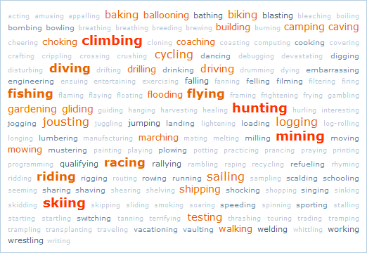
Here is the tagcloud of the words which happened to get more than one result:
If you check the words which do not appear frequently, you unfortunately do not always find contestants for the Darwin Awards. First, some parasite links from reactions about the xkcd picture, or animal deaths, but also some more annoying things: participial adjectives (amusing, embarrassing, interesting...) and verbs which do not express an activity, rather circumstances (exploding, crushing, choking...). For the latter, I have no solution. But it's quite easy to remove the participial adjectives automatically. Of course you can do it with a syntactic parser, or even a dictionary but I prefer to go on with Google result numbers.

I made a few tries before finding a nice criterion. Comparing the frequency of the participle form with the infinitive form (hoping it will be greater for participial adjectives) or computing the occurrence percentages of the participle just after "a", "more", or "most". On the graph on the left, the first 5 verbs give participial adjectives. We can see that the "a ..." strategy fails, because of the inclusion of participles into nouns: "a frying pan" explains why "a frying" is so frequent. Anyway "most ..." seems to help making the distinction:

Once those participial adjectives have been filtered, one can count not only the number of "died of a ... accident", but also "a ... accident", as well as the number of answers for the participle itself to get things like accident rates (blue) and death rates (red) :If your hobby is not in the list, at least you have a basis to compare it. If it is, well, be careful, especially if you plan on jousting next weekend!


This post was originally published in French: Danger : accidents mortels !
As usual, the source files: list of more than 3000 English verbs and their computed present participle, testing Google detection of participial adjectives, results of Google requests.

Thursday, January 17, 2008

Britney-Amy : Celebrity Deathmatch!

Discovered on French television last week, WhenWillAmyWinehouseDie.com and WhenIsBritneyGoingToDie.com provide an interesting challenge: guess when the two divas will die, the closest wins an iPod Touch, or a PS3. Huge buzz, of course, thousands of people went there to take a chance and leave a pre-condolences message. Both sites are of course optimized to make money with ads (contrary to this more confidential game, which is just as sweet though: the "TopMort", where you can pick up people you think will die within the year, and who have not been ), and only provide raw data entered by people who signed. No stats at all, what a shame.

I was very lucky that Matthieu Muffato, a friend who happens to be an impressive Python expert, used a few code lines and some execution hours to retrieve the data and mail it to me.

The initial question I had about it was simple: what is the biggest time interval not yet chosen, which would a priori maximize the chance to win? By "a priori", I mean considering any time interval of some fixed length is uniformly dangerous for Amy and Britney, and uniformly chosen by other visitors.

Unfortunately, those ideal conditions are far from being true in the real world, for a very simple reason: the visitor wants his iPod or PS3 right now, not in 30 years! So if you wish to target a month that has not yet been chosen, for Britney, you will have to wait for February 2023. For Amy, there has been less voters yet, so if nothing has changed since data was retrieved, november 2016 is still available, or you can try year 2031 as only october was chosen then. I must add, as Matthieu told me, that those websites contain no date after January 2038, probably because of some date coding problem. Now let's move on to more serious stuff, here is an overview of the number of votes per month (with a simple vertical normalization for Amy who received less votes, sorry for the title in French...) :
I guess you are as flabbergasted as I was when the curves appeared: they are almost identical! Correlation coefficient equals 0.98, we get the same power law! We can check that it is indeed a power law using a log-log dotplot, which also gives us approximately the equation Y=4-3X, in logarithmic coordinates, that is when we go back to linear: y = 10 000 - x^(4/3), which is the equation of the pale blue curve.

In fact power laws are everywhere in real data, (especially in small-world graphs which have a power law degree distribution). What is surprising here is that both laws have approximately the same parameters. If we check the details we can notice however that voters prefered 2008 for Britney and 2009 for Amy.

By checking the curves carefuly, one also notices some kind of periodicity. At least they are not monotone, and I've put on the left a representation of the percentage of votes per month, each year from 2008 to 2013, for Miss Winehouse. Variations are quite strange, as august attracts twice as much voters as november! I don't have any explanation for those smaller choices of Novembre, December and February, it may be a mechanism similar to what Knuth describes in one of the first exercises of Volume 2: ask a friend (or an enemy) a random digit, he will more probably say 7.

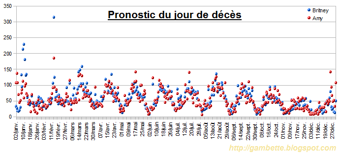
Here is the representation of the choices per day, for any year. I've removed January 1 which was artificially big (due to the year coding problem, which gave a lot of 01/01/1970).
We can observe a new surprising periodicity phenomenon: voters prefer the middle of the month. Note also the vicious voters who chose February 14, poor Britney! Even the dot of her birthday, December 2, is quite high compared to its neighbors...

So to forget about those sad things, let's end with emotion and poetry, here are the pre-condolences tag clouds (made with Freecorp TagCloud Builder) for both stars.

This post originally appeared in French: Britney-Amy, duel mortel.

Vote spreadhseet file by day, by month, contact me if you would like to get other source files.